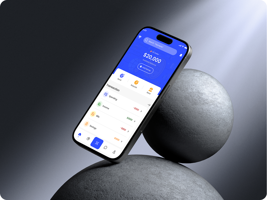
Project Overview
Designed a clean, intuitive mobile finance management app tailored for modern users. The challenge was to simplify how users interact with their money while maintaining a sleek and engaging interface.
Role: UX/UI Designer
Tools: Figma, Illustrator & Photoshop
Duration: 3 weeks
Project Overview
Traditional banking apps often overwhelm users with cluttered dashboards and confusing navigation. Many users — especially younger, mobile-first individuals — expect simplicity, speed, and a visually clear experience when managing their finances.
Research & Key Insights
- Conducted short interviews with 20 users (age 18–30)
- 70% preferred visual summaries over text-heavy statements
- Common pain points
- Confusing transaction history
- Hard-to-find budgeting tools
- No quick overview of spend/save trends
Design Process
1. User Flow Mapping
Mapped the primary tasks users need to complete:
- View balance
- Track spending
- Set budgets
- Transfer funds
This helped structure the overall IA (information architecture).
2. Wireframes to Hi-Fi
Iterated from grayscale wireframes → interactive hi-fi prototypes with real content and micro interactions.
3. Visual System
- Used a soft blue/purple palette to inspire trust and calmness
- Adopted large, readable font styles
- Introduced iconography to make financial data more approachable
4. Testing & Feedback
- Tested hi-fi prototype with 10 users
Key feedback:
- Loved card-based transactions
- Wanted spending graphs on homepage
- Suggested “dark mode” as must-have
